Sunday, October 31, 2010

Industrial Design

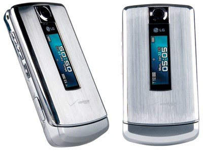
*Photo from iTech News Net (itechnews.net), LG 8700 Review


In my opinion, Industrial Design is one of the most difficult focuses in design; I feel there are more constraints for industrial design. While the laws of physics and other sciences apply to every field within design, industrial design is especially restricted. For a couple examples, a chair cannot collapse under the weight of a person and cooking utensils cannot melt at common cooking temperatures. The picture above shows a cell phone I used to own, the LG 8700 made for Verizon Wireless. I really liked the phone and the majority of people complemented its aesthetic design. The only comment that wasn't a straight compliment was, "It kind of looks like a refrigerator." However, even that comment didn't have a negative connotation. The truth is, the phone was poorly designed. Let me explain.

Probably the two most prominent elements of the phone would be the texture and the shape. The exterior of the phone is constructed out of stainless steel. In an optical sense, the texture is sleek and the vertical fibers provide the sense of metal rather than plastic, which typically is associated with higher quality. When looking at the haptic, or actual, texture, the sensation of metal is all the more prominent. The phone, while idle, was cool to the touch. The shape of the phone suggests convenience. It is small enough to use with one hand, it can be stored in a variety of places, and it isn’t a nuisance to carry around. Additionally, strong linear lines appeal to us.

Aesthetically, the design was nearly flawless. However, when it came to functionality, there was at least one serious issue. Consider the exterior; it was made of stainless steel, which absorbs temperatures very easily. Idle, the phone was cool, when in use, the phone would heat up… considerably. The phone would get so hot that it would eventually fry its own Bluetooth mechanism. Here is an example of poor design: the item caused damage to itself. It took me a while to discover this unfortunate flaw. While I had the phone, California introduced a new law banning the use of cell phones without headsets while driving. This law forced me to get a new cell phone that was capable of operating a Bluetooth headset. Now, whenever I think about industrial design, I think about this phone and consider all the concerns these designers must face. Industrial designers must know how to design aesthetically, while at the same time understand mechanics, science, and all other physical elements they may encounter.

Monday, October 18, 2010

What Came First: the Label or the Price Tag?


 What about the "designer" label compels consumers to spend ridiculous amounts of money on clothes and accessories? Or, did it happen the other way around; did the "designer" status originate from the price tag? A "designer" brand isn't really the correct term; society implies a limited selection of praised designers, when in reality, every piece of clothing was designed by a designer. The difference here is whether the name can be recognized, and more so, that the name is associated with certain qualities.


Louis Vuitton, Vera Wang, Jimmy Choo. These are a few of the designers who warrant the "designer" status in the public's eye. While in many cases, these designer's do offer a higher quality product, there are plenty of "no name" designers with just as nice of products at half the price. It seems, however, even if the physical quality is the same, many consumers would still pay $400 for the Louis Vuitton handbag instead of $120 for the nameless leather bag at a local boutique. Part of the product is the name plastered all over the product. So when the consumer purchases a Louis Vuitton bag, they are not only giving their money, they are also serving as free advertising (less than free actually; they paid for it). Brilliant! At least from the perspective of the ritzy designers. Advertising, money, and a hold on the market simply by using their name. The "no names" don't have the name to boost their product's value, which makes it difficult to get recognition.


Some already known names try to use the same tactics, but the name is everything. For example, Paris Hilton's show line will never amount to the status of Jimmy Choo and his shoes. Paris Hilton has a name to boast, but due to her rather racy scandals, her name isn't associated with quality.

Compare and Contrast

 
The check mark. We've all seen it. It is a sign of accomplishment; completing a task on our to-do list or getting the correct answer on a homework problem. In those regards, it is clear why a company would choose the classic check mark for their logo. The logo above is obvious; Nike. Let us consider Nike's logo, and the logo of Verizon Wireless, who also implements a check mark. These two companies are very different; one is a brand of sports equipment, and the other is a cell phone service provider.

While these logos have the same origin and same general shape, there are a couple differences; both in the details of the image and the reception from the public eye. Nike's logo is softer and fluid; it mirrors the qualities desired in Nike's product. This places a connection between the visual with the product in a positive manner. Additionally, these qualities visually alter the original check mark just enough to standout. As a result, Nike's logo can stand alone, without the company's name next to it (as illustrated above). The fact that Nike's logo can stand alone allows it to be more flexible; for example, the logo can be in any color and it will still be recognizable.


In contrast, Verizon Wireless has a much more static check mark. It seems more efficient, more stable, which are qualities you want in a cell phone service provider. Again, the connection has been drawn between the visual qualities of the logo and the qualities desired in the product. However, the check mark here does not stand out as much as Nike's. If you saw this check mark on it's own, it would be difficult to place with Verizon. I would imagine that is why Verizon uses its name, especially the "z," as an element in its logo. Additionally, Verizon has chosen a permanent color for their identity; red. That would be impossible for them to stray away from.

Nike has one of the best logos in the world. It is simple, reflects qualities of the product, and can be recognized without the company's name. That is not saying that Verizon does have an effective logo, but it does not have the same power as Nike's. It is interesting to see the very different ways the check mark has been used by these two very different companies.

Sunday, October 17, 2010

Design as Conversation


Like a conversation, Design cannot standalone; there are no monologues, no solo acts. A creative design does not simply come into existence, it is the extension of something else. Designs progress and evolve by going back and forth, feeding off the ideas and successes of previous designs in order to inspire new designs.

Designers may converse through design from opposite sides of the globe or within the same office. A designer will create something, and put their work out there. When another designer is working on something, they may see that first design, and use a general idea or a piece of it and put it into their own design. For example, look at the picture above. Throughout the years, car models will alter their design little by little. However, there is always a hint of the previous model, the inspiration, in the newer model.

* Photo from NotCot.org, http://www.notcot.org/post/12238/

This idea of a conversation, the chain of inspiration, may be intentional or subconscious. For example, by looking at the images located above or below, it is clear that many companies use similar logos. In the case of the Starbucks logo (below), many other coffee establishments chose a similar logo to that of Starbucks. It is clear that the conversation isn't based on an emotional connection. Here, the idea is that Starbucks has done so well as a business, and to mimic its success, its logo should be mimicked as well.


*Photo from The Legality, an online law journal located at http://www.thelegality.com/2008/01/23/does-scrabbles-cd-spell-the-end-of-scrabulous/

Monday, October 11, 2010

100 Miles from Nowhere

Tree of Life, Peter Lik
Peter Lik is an award winning landscape photographer from Australia. I remember first walking into his gallery in Lahaina on the Hawaiian island of Maui; his photographs were absolutely breathtaking. While nature itself is not design, the manner in which the photographer shows nature is design. It is clear from Lik's photographs that he is inspired by the environment and color. The vast majority of his photos depicts overly saturated scenes of the natural world, and occasionally architecture. Lik has said "Mother Nature sets the scene, I simply capture it."

Dreamland, Peter Lik
Peter Lik does not use any form of digital manipulation. To my knowledge, he most often uses Fuji Velvia film, which is a slide film that is sharp and ultra saturated. Additionally, his camera choice is the Linhof 617 and a Hasselblad camera and he makes use of various darkroom techniques. However, skeptics still insist that he uses Photoshop. Personally, I find it hard to believe that after his countless awards, experts trained to find doctored images would fail to notice his if they really were subjected to Photoshop.

Castaway, Peter Lik
I recently learned that Peter Lik has an upcoming reality TV show, which is entitled "100 Miles from Nowhere" and it will appear on NBC. From what I've gathered, the show will challenge Lik to go all over in an attempt to get nearly impossible shots. I am thrilled to hear of this new show for a couple reasons. As I said in my post on Philippe Starck, I feel it is about time that design (and by extension, photography) gets some recognition in mainstream media. The fashion designers, singers, dancers, and chefs can share some of the spotlight and fame with designers and fine artists. Really though, it's not about the fame, it's about the appreciation for other talents and art forms. Secondly, for me personally, Peter Lik is one of my favorite artists and I am looking forward to seeing his process for taking photos. I think it will give me more insight into landscape photography and hopefully help me expand my own photography skills. Lik has already inspired me to try Velvia film; I'd like to see what else I can learn from him.

Angel's Heart, Peter Lik

Here is Peter Lik's photography page from his website
http://www.peterlik.com/photography
* Please note that my specifics on Peter Lik's photography techniques are based on various internet sites and have not come from an official Peter Lik source. The photographs and titles came from Peter Lik's official website (the link above).

Sunday, October 10, 2010

Creativity from Without


I'd like to talk about people who find their inspiration and creativity from outside of themselves. These are not the people who create based on their past experiences, religion, or unprovoked emotions. I am talking about the people who look to sources such as colors, nature, other artists/works, technology, sounds, and so on for their inspiration. Specifically, I'd like to mention Siebren Versteeg, an American mass-multimedia artist.

I first heard of Versteeg this summer while walking through the Rhode Island School of Design Museum, where his exhibit, "In Advance of Another Thing," was stationed for the summer. Here, in the contemporary section of the museum, my friend and I stumbled upon a room full of strange monitors. Two in particular caught my attention. One monitor was a very large vertical touchscreen with a collage of images that allowed viewers to drag new areas of the collage in and out of view. Essentially, it was an infinite touchscreen. The other monitor was a small, old fashioned TV showing a hand holding a picture, retracting out of the frame, and appearing again with a new picture. The images depicted in the monitors were seemingly random. As it turned out, the monitors were linked to the internet, pulling images from the world wide web and placing them into the pieces of art.

After more research, I have discovered that the images are not entirely random; Versteeg designs the criteria of the images, and they are meant to almost tell some sort of narrative. Not only does he design the criteria, he also designs the compositions and makes his own style apparent while still forfeiting some of his creative control. Technology is one of his inspirations, though it is not simply technology alone. The small television piece, entitled "Boom (Fresher Acconci)," is a comment on the technology boom in our contemporary culture. While Versteeg is inspired through new technologies and observing modern society, he also is inspired by Jasper Johns' flag paintings and Vito Acconci’s video, The Red Tapes. When looking and interacting with Versteeg's work, I felt that he really delved into a new, hardly touched medium: the internet.

Here are the pieces that appeared in the exhibit, the two first ones are mentioned above.
http://www.siebrenversteeg.com/work.asp?uid=94
http://www.siebrenversteeg.com/work.asp?uid=70
http://www.siebrenversteeg.com/work.asp?uid=96
http://www.siebrenversteeg.com/work.asp?uid=100

Additionally, check out the RISD Museum website. The museum itself is very impressive.
http://risdmuseum.org/Default.aspx

Stone Soup

* Photo: Stone Soup illustration by Marcia Brown, 1975
Stone Soup is an old folk tale that illustrates the benefits of collaboration. Essentially, a village turns a situation of food scarcity into a festival of delicious soup by working together and putting their own contributions into the simmering pot. In our Design 001 class activity, Stone Soup, we learned the importance of working together and throwing our ideas into "the pot" to create something bigger and better than what could have been achieved on our own with simply using our own materials.

In my group, we had an array of materials: art supplies, an art smock, a board game, a Frisbee, bottles, boxes and more. By looking at the pile of items we brought, it would be impossible to tell what would be created. Though, our design was not simply aesthetic, we created an idea, a story, to go along with it. We created a dream world, complete with multiple characters and a puppeteer.

Our final product was significantly beyond what I had anticipated. Originally, I went into Stone Soup expecting a small, mish-mashed "thing." I suppose that is what Stone Soup was about; creating something big from many small ideas. We started with a few thoughts, and the next thing we new, the rest came naturally. Stone Soup was just like a snowball of ideas.

Here is our final product, an installation piece that illustrates a dream from our smaller character. Although, we all had a number of ideas of what the story should be. But I suppose that's part of art; it is subjective to the viewer, as well as the creator (or creators).

Monday, October 4, 2010

Design: Everywhere and Underappreciated

*Photograph; desk by Philippe Starck.

There is a designer by the name of Philippe Starck. He designs just about everything: chairs, buildings, watches, motorcycles, dishware, lamps, desks and more. While I am not a fan of his style, I agree with the basis of his ideals; design is everywhere. Design is the chair we are sitting on, the drawers we keep are clothes in, the car we drive. It was all designed; pre-determined by humans.

Though design is a huge part of every person's life, I feel it rarely gets the respect and acknowledgment it deserves. Fame from design is not common; Ralph Lauren, Betsy Johnson, and Giorgio Armani are some of the scarce few designers to achieve fame within popular culture. The common focus of design here is fashion. But what about architects, magazine designers, industrial designers and the rest? Fashion claims the fame while other forms of design are overlooked.

Philippe Starck has made an attempt to reach out for new design talent and show the world what design is about. Last year, on the BBC, Starck began a new reality show "Design for Life." The show is essentially a talent search contest for design students. What appeals to me is that the show focuses on all design concentrations: interior, industrial, graphic and so on. While I am not sure of the show's success in the UK, I hope something along the same lines makes it to the United States. It may open the public's eyes to the fact that their chair, plate, watch, kitchen, house, lamp, etc. were all designed by a designer.

I don't expect "Design for Life" to achieve the success of "American Idol" or the "Top Model" series (I am not sure that Starck's show is still running). Nor do I expect many designers to achieve the same level of fame as celebrity singers and actors. But I hope we designers make progress someday.


*Photograph of Philippe Starck from "Design for Life"

The Black Box in the Room

*Photo from ApartmentTherapy.com

The television has become the center point of modern living room feng shui. This tacky focal point is extremely common in American households. And yet, its tackiness rests out in the open. Televisions are not attractive and their function is shallow. In my opinion, televisions impair the aesthetic quality of a room. However, I believe there are possible ways to avoid detracting from the room’s attraction. For this, we will consider the problem and solutions in term of interior design and industrial design.

One solution, the interior design solution, is to obscures the TV from plain view. The most efficient means would be a media cabinet with closed doors. The cabinet would act as a piece of artwork that encases the television. Basically, not only would a cabinet hide the television; it would also add an extra element to the design of the room. Additionally, if a more attractive room is not enough incentive, a cabinet would also protect your expensive and fragile TV from dust and physical harm. It is difficult to say why this method is not often utilized. Possibly, it is because that many people tend to design their rooms themselves and lack the knowledge or physical ability to implement such a cabinet. Another possibility would be that it seems few carpenters/interior designers make cabinets that actually hide the television. Most media cabinets present the TV rather than mask it.

This cabinet hides the TV, it is unobtrusive and lightweight
Ballard Designs
http://www.ballarddesigns.com/Furniture/Armoires/TV-Armoires/Wexfield-FlatScreen-Wall-Cabinet/p/6438

This media station presents the TV in an obnoxious manner,
and unfortunately, these are the most common
From Quality Fit
http://www.qualityfit.co.uk/images/home_cinema/large/Walnut%20TV%20Cabinet.jpg

The second solution, which relies on industrial design, would be to alter the appearance of the television itself. Today, there are televisions less than an inch deep that can be hung on the wall, taking up as little space as possible. And yet, it is still a black box that the human eye cannot ignore. Changing the color, texture or shape of the TV could make a significant difference in the design of the room. Apple figured out computers look better with sleek white exteriors, but that revelation has failed to apply to televisions. Or the best solution may be to revert back to when televisions were made from wood. Older televisions used wood as to resemble actual furniture. With technology today, television can remain thin and lightweight, but nothing dictates the need for cheap, plastic exteriors.

While the weight and bulk of this TV is outdated, notice the accents 
and drawers; a lot of attention went into the exterior design.
http://forums.xkcd.com/viewtopic.php?f=2&t=14367&start=640

I personally cannot see a concrete reason why televisions have lost their status as a piece of furniture, one that requires aesthetic appeal. Televisions can be viewed as an opportunity to add new features to the room while retaining their functionality. The consumer may choose to purchase a cabinet or the producer may choose to utilize better industrial design. However, though these solutions are possible now, I believe they will not seriously be addressed until television technology, or quality, has reached its peak.

Sunday, October 3, 2010

First Memory of Design

"The Rainbow Fish" is a beloved book from my childhood. The truth is, I do not remember the story or lessons from the book at all. The images, however, have stuck with me over the last 15 years. The visuals from this book make me consider the impact of color and texture in regards to the effectiveness of an image. As the title suggests, color plays a big role. These colors range from deep to pale and warm to cool. The gradients and transitions are soft; emotional in a calming manner. The illustration style is like a water color painting, except the reflective sparkle that accents the fish. I think the textural difference added by the sparkling material makes the visuals stand out. As texture can easily be overlooked in the creative process, I am able to appreciate the uniqueness of this book. When recalling my time at preschool, some of my fondest memories involve the days when I would sit on the floor and flip through the pages of "The Rainbow Fish."