Monday, November 29, 2010

Design is Dangerous

I thought I would continue the theme of Adolf Hitler. In my previous blog, I talked about Hitler's initial design of the Volkswagen Beetle and his idealistic beliefs that everyone should own a car for themselves. It is a rare light-side of Hitler, but let us focus on the dark-side that we all know so well. We all know of the hideous and horrific actions taken by Hilter and the Nazi party.

http://www.holocaustresearchproject.org/holoprelude/nazprop.html

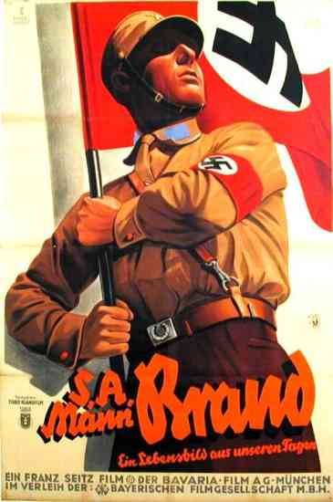
The design of Nazi propaganda is easily recognizable. Like much of advertising and propaganda, the Nazi party believed their views were for the best and would benefit society. However, the persuasive power of this propaganda helped drive a violent movement of genocide. Of course, genocide itself was not actually advertised, the propaganda slyly promoted other corresponding ideas within the Nazi party.

http://thinkingouttabox.wordpress.com/2009/10/11/evolution-of-car-logos/
These images, while not a single design, they represent examples of a specific series of designs. The images represent the idealistic aspects of the Nazi Party while omitting the horrific aspects of it. Advertising is often "sneaky" in this way. They gain support and approval for both aspects of a cause; the glorified good aspects and the omitted bad aspects. It is unfortunate when these plans are successful.
http://www.uncp.edu/home/rwb/hst430_p1.html

Design in Society

What is a design that aims to improve society? I decided to think outside the box a little and talk about the Volkswagen Beetle and its origin. To many people's surprise, the Volkswagen Beetles was initially designed by Adolf Hitler. At first, this thought kind of scared me; I mean... it's Hitler. But giving the idea a little more thought, it makes sense. Hitler strived for a utopian society; while his views meant the genocide of those who would corrupt his perfect world, his main goal was to create an unblemished society in Germany.

http://www.hitler.org/artifacts/volkswagen/
Hitler wanted a simple car that everyone could own; it was "the car of the people." Again, as Hitler believed in a communist society, he strongly felt that every person should own a car; it was a certain privilege or right. Given the time period, automobiles were common, but not to the extent where everyone had one. Hitler believed all his citizens could benefit from having a car; from practical use to vacation and leisurely use.

http://strangevehicles.greyfalcon.us/HitlerKDF.htm
The idea that everyone should own a car is very different from the idea that anyone can own a car. Hitler strongly believed his ideals would make a better place to live; rather, a more overall privileged society.

Color Transforms Design

http://www.ecovelo.info/2010/05/10/the-rolling-stop-and-a-confession/

How does color transform a specific design? Imagine if a well known design were to change its color suddenly, what would be the result? Let's take a stop sign; it does say "STOP" and it maintains its octagonal shape. However, imagine the sign were suddenly changed, perhaps to green or yellow.

Red stands out among all other factors found in the environment. It is easily distinguishable against foliage, because plants are typically green (red's complimentary color). The red also stands out against the blue of the sky, or any neutrals found in nature or urban settings; such as browns, grays, etc. It is pretty easy to see why red was chosen for the stop sign.

http://www.worth1000.com/entries/188559/stop-sig
 What if the sign was green? Well, this probably wouldn't work so well. The green would blend in with any foliage in the area. Additionally, as green and blue are analogous colors, green would not stand out. Also, as green is typically understood as a command "to go," it could get confusing. Of course, the green light could always be changed to another color to indicate drivers should accelerate, but then it creates even more complications.

http://www.myparkingsign.com/MPS/article_Yellow-Stop-Sign.aspx

What about yellow? Now yellow would stand out against most other relative colors in the environment (both urban and natural). However, what about all the other traffic signs? Most of them are yellow too. Now, to avoid confusion, if a stop sign was changed to yellow, we would have to find a new color for all the other signs.

Here, we can see that the appealing aspect of red is that it stands out from other colors. It is dependent on the world around it. As Josef Albers says in his book, Interaction of Color, we never experience colors alone; how we perceive colors is relative to other colors. Green cannot be used for stop signs and green lights that indicate acceleration. Yellow cannot mean stop, slippery roads, lane ends/merge over, and all the other signs; it's just too much for one color.

Monday, November 15, 2010

Ergonomic Design: UCD Student Housing Desk

Ergonomics refers to user safety and ease of use for the user; well designed with the consumers’ wellbeing in mind. Ergonomic design has 5 main points to consider:

1. Safety

2. Comfort

3. Ease of Use
4. Performance

5. Aesthetics

I’d like to talk about ergonomic design in regards to my desk, which was provided for me through UC Davis student housing. I chose to do my desk because I had been experiencing pain in my right shoulder after prolonged use of my desk. As ergonomic design works to prevent stress injuries such as this, I figured analyzing my desk in this manner would provide a new perspective.


Safety of the product refers to whether or not the product inflicts harm to the user or malfunction in a way that will cause harm. The desk is safe in the sense that there are no splinters or direct harm. However, there are certain aspects that seem questionable. For example, the shelf above is not attached to the base and it is possible for it to fall. Basically, there is potential for harm, more so than the average desk.

Comfort of the product has a couple elements: use of the product must not be dreaded. The product is poorly designed if consumers suffer general pain from using it. My desk is not comfortable in the slightest. The panel that pulls out is at an awkward length that can cause pain due to repeated movements (stress injuries). While this could be fixed through chair height, the said chair would have to be capable of a relatively high position, as the desk is abnormally high. Additionally, the desk is very rigid and it is obvious no thought was put into the idea of comfort.


For this section, I will combine both ease of use and performance. Ease of use obviously means how effortless the product is to use and performance considers the product’s proficiency and how well it works. A desk is fairly straightforward, however, this desk has some issues when it comes to functionality. The drawer that pulls out ends up blocking access to the drawers below, especially the top drawer. Lastly for this section, the desk itself does not have much desk space, leaving little room for all school supplies and office-like supplies.

The aesthetic qualities, or visual appeal, are fairly bland. Nothing particularly stands out. The wooden tone is on the lighter side, but still not too pale. The physical properties are boring; no carvings, curves or any such elements are present. While linear lines are not bad, the manner in which they are utilized on my desk are boring. Although, the bland aesthetics can be good because, by nature, the desk is very neutral and therefore will not clash with any area of décor UC Davis students may have in their room.

In conclusion, the desk is not poorly design in a purely aesthetic quality; in that sense, it is designed to fit within an array of designs. However, when it comes for safety, comfort, and functionality, the desk illustrates a failed design. It is not enjoyable to use, in my case it causes stress injuries, and the top shelf is not secure and could easily be knocked off. My conclusion is the desk was relatively cheap, made to look functional without much thought actually going into the design.

A versus A


When we write by hand, we use a lower case a, that is, an 'a' with a tail. However, nearly all fonts on a computer use an a just like that.  Why is that? Type attempts to be formal, but consider what is formal: efficiency or elegance?


Could type use a to be more efficient when reading; perhaps aiming to be more sharp? a at first glance may not be totally distinguishable from an o or Q. Therefore, font designers may consider the fact that a stands out much more than a as its own letter. This could be particularly helpful for long typed documents. However, type is not just supposed to be efficient. There is a certain elegance that goes along with type; it is capable of precision and consistency that the human hand can not master. In my opinion, a is much more elegant than a... a flows and is much smoother. While some fonts flow and may use more of a cursive style, they are extremely obscure.


A few fonts will change the form of the letter a based on regular or italicized; look at Times regular a and italicized a. There is only really one font that uses a in the font's normal style, and that is Comic Sans; which has a poor reputation. Comic Sans is a relatively new font, so other font designers did not learn from Comic San's mistake. It is interesting the first font to use a is considered a failure in the world of fonts and design; though, I doubt the form of the letter a is a substantial contributing factor. To read more on Comic Sans, see this article from the BBC: http://www.bbc.co.uk/news/magazine-11582548.


Monday, November 8, 2010

Colors and Color Associations

Different colors invoke different reactions on the human mind. Each color has a different reaction associated with it. These reactions are not blatantly obvious to us, they are subtle. Some common examples are yellow for happiness and blue for sadness. Most of the research regarding color associations is rather... iffy. But I believe there is some truth in these studies. If this wasn't true, then why is blue overwhelmingly the most common favorite color? 

Blue Nude I, Henri Matisse
Stereotypically, blue suggests sadness. However, I think there is more to the color blue than that generic stereotype; there has to be something positive about the color. Some sources say that blue has a calming affect. Others suggest that blue is associated with constant and familiar elements; such as the ocean or the sky. Most of the general population considers blue to be their favorite color, therefore, there has to be more to blue than sadness. There are other indicators that color association is relevant. Consider the combination of red and yellow.
 
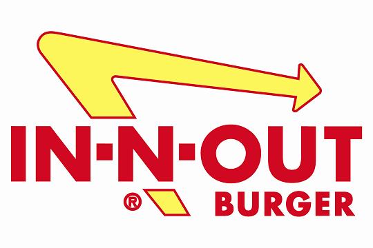
It isn't a coincidence that McDonald's, In N' Out Burger, Wendy's, Carl's Junior, Denny's, Sonic, and Pizza Hut have all coined red and yellow as their signature colors. And no, it is not to match the colors of the ketchup and mustard. That color combination has been suggested to stimulate hunger and thoughts of food. Here, all these companies designed their image, not based on the suggested color schemes within the color wheel; they designed based on the human psyche.
 
While many people are skeptical, there is evidence right in front of them that colors do have a psychological stimulating effect on people. I am not saying the effect is significant, but there is something. For those people who still refuse to believe; just consider how much money all those franchises spent on their identity and campaigns. Those companies would not have spent so much money on something that does not matter.

Saturday, November 6, 2010

Words and Images in Cartoons and Comics

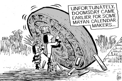
In class with Dr. Housefield, we have spent a lot of time discussing comics. However, I'd like to branch out a little and talk about cartoons and how text is implemented within them. After reading Scott McCloud, we should all understand the difference between comics and cartoons; but I'll just explain the main point. Comics are juxtaposed sequential images, whereas cartoons have singular panels. So how does the use of words differ between the two? Well think about it, they have different functions. Comics tell a narrative, a story; cartoons are images, often over simplified, that are intended to be a humorous comment or satire (according to the dictionary definition). Thus, in comics, text typically helps move the narrative along. In cartoons, text is a quick jab, explanation, or comment.


The above image is a cartoon; it is a single image that makes a humorous comment or stab at an idea. Here, we see members of the ancient Mayans crafting the famous Mayan calender that ends in 2012. While many believe that since this calendar ends in 2012, it marks the end of the world. Obviously, the artist of this cartoon does not believe this, and came up with his or her own "explanation." The text explains what the image means, because without it, we the viewer wouldn't know what the subject matter is really revealing. 


Now this image above shows a comic. The text is used to move the story along. There isn't a short, quick explanation of everything, there is no underlining commentary on the subject matter. However, what we do see is words progressing and moving the story forward.

Thursday, November 4, 2010

Text and Images in Information Design

What is the importance in joining text with images? Let us consider the use of text with images in design; text conveys information, an idea, or a narrative. We can see these uses in graphs, advertisements, comics and more. Yes, I said graphs. Graphs are part of the informational aspect of design, which is typically outside our narrow definition of "design." Information design, which displays quantitative information, reaches all realms of study and aspects of life. Graphs, diagrams, maps, books; these are examples of information design. The principles and elements of art and design apply here. In the book, Design Basics, Lauer and Pentak talk about various elements of design, such as line, color, scale and proportion. All of those elements can be applied to graphs (as well as other forms of information design).We typically think of them as purely forms of information; they explain things to us. However, their explanations would be useless if they was not designed in an efficient way that we could understand. If it wasn't for text and image working together in information design, our society would suffer greatly from the lack of accessible data.

http://upload.wikimedia.org/wikipedia/commons/8/87/Tokyo_subway_map.PNG
http://kara.allthingsd.com/20080514/memo-to-don-graham-thar-he-blows/

Think about it... Without proper maps, how would anyone know which subway train to take? Without labels on diagrams, how could anyone understand their science text book? Without labels and numbers on graphs, those charts in math class would be even more complicated. Education and travel would be exclusive privileges given to the elite.


Examine the diagram above. Try to name every part of the animal cell depicted. It isn't so easy. Even if you were simply trying to learn, it would be difficult if your text book explained things like "... and the tail-like extremity is called the 'flagellum,' and the yellow structure to the right is called the..." This would require a lot of jumping back and forth, proving an ineffective and inefficient means to communicate information. Look below at the diagram; with labels. The drastic change in understanding makes a huge different in the usefulness of the diagram. 

http://www.kvhigh.com/Documents/Notes/reid/reid.html

Now let's consider a different kind of information design; with minimal text and minimal images compared with diagrams. When we think of graphs, we probably think of our last math or economics class. But text, image, and design are all present here. If you look below, the graph has lines, it is color coded, and the scale is even across all visual elements. But without words or numerical values, it is impossible to understand the graph.


Perhaps one of the biggest accomplishments in information design was done by Massimo Vignelli and his work with mapping the New York subway. Without Vignelli's work, one can only imagine the chaos that would plague the New York public transportation. His use of lines, points, shapes/forms, color coding and so on clearly indicates a use of design as explained in Design Basics. And while some information could be concluded from those pictorial elements alone, that information would be insufficient; the text is necessary to determine the meanings.

http://www.apartmenttherapy.com/ny/artwork/massimo-vignelli-updates-his-new-york-city-subway-diagram-048963

Monday, November 1, 2010

Poorly Designed

What constitutes as a bad design? In my opinion, it is when the design does not effectively or efficiently achieves its goal. My last couple posts talked about industrial design and functionality within that realm; however, what about poor graphic designs? Graphic design, or visual communication, strives to convey a message or emotion. If the viewer cannot comprehend the message right away, the image is poorly designed. Consider the 2012 London Olympics logo.

I first saw this logo months ago, and I only saw shapes. It wasn't until I read an article on the BBC website that actually specified that the logo depicts "2012." Finally, after months, I saw the 2, the 0, the 1, and the second 2. Then, talking with others, I have found I am not the only one who didn't see the message, the content, that was intended. Some people can't help but see shapes, or an actual picture/scene when looking at the logo (the said scene depicts a long time cartoon character, and that is all I will say). Personally, I did not see a specific scene, but I found myself trying to figure out if the logo was trying (and failing) to be an actual scene or if it was merely shapes. In the end, I was wrong on both accounts. What could have been done to avoid this graphical disaster? Color varients between the digits? Letter spacing? Less abstract and more traditional typography? It is difficult to speak for the whole, but from my perspective, all the above could improve the design. While that is purely subjective, others may find that the logo as a whole should be scrapped and a new logo should be designed.

Objectified: Form and Content


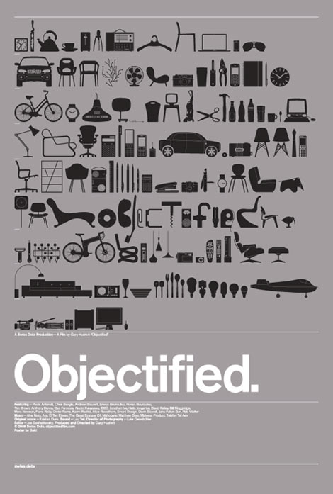
What is content and form? And what do they have to do with one another. Content is the idea conveyed through a piece while form is the shape and structure of the piece (according to Lauer and Pentak from Design Basics). In the documentary film, Objectified, director Gary Hustwit shows his audience the world of Industrial Design. In the everyday world, the idea that everything we use and see that is man made was designed. Typically, for me anyways, we will see an object and not give a second thought as to how it came to be; of course it’s here, of course it's like that. Tooth picks, bowls, spoons, etc. are overlooked and taken for granted, and industrial designers remain forgotten.

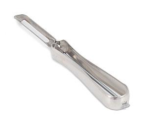
Let's consider how content can apply to industrial design as illustrated in Objectified. Content can be the functionality and purpose of an item, but in a more specific way than usual. Consider a peeler (such as for potatoes), it is one thing to have simple peeler that is meant to peel various foods. However, the purpose may extend further, such as when ergonomics are applied. Ergonomics refers to something that is well-designed, user-friendly, comfortable, and safe. The example in Objectified showed ergonomics applied to a peeler and spread to other tools. Here, the peeler was altered to cater to the needs of arthritic users. This altered the form of the peeler by introducing an new aspect to the content. The form was changed to be more comfortable for users of the peeler because the content changed by adding concern for the user's comfort to the intention rather than just having a basic peeler.

http://www.lefsetime.com/store/template/product_detail.php?IID=138

http://www.organize-it-online.com/itm_swivel-peeler.html

Sunday, October 31, 2010

Industrial Design

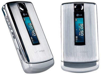
*Photo from iTech News Net (itechnews.net), LG 8700 Review


In my opinion, Industrial Design is one of the most difficult focuses in design; I feel there are more constraints for industrial design. While the laws of physics and other sciences apply to every field within design, industrial design is especially restricted. For a couple examples, a chair cannot collapse under the weight of a person and cooking utensils cannot melt at common cooking temperatures. The picture above shows a cell phone I used to own, the LG 8700 made for Verizon Wireless. I really liked the phone and the majority of people complemented its aesthetic design. The only comment that wasn't a straight compliment was, "It kind of looks like a refrigerator." However, even that comment didn't have a negative connotation. The truth is, the phone was poorly designed. Let me explain.

Probably the two most prominent elements of the phone would be the texture and the shape. The exterior of the phone is constructed out of stainless steel. In an optical sense, the texture is sleek and the vertical fibers provide the sense of metal rather than plastic, which typically is associated with higher quality. When looking at the haptic, or actual, texture, the sensation of metal is all the more prominent. The phone, while idle, was cool to the touch. The shape of the phone suggests convenience. It is small enough to use with one hand, it can be stored in a variety of places, and it isn’t a nuisance to carry around. Additionally, strong linear lines appeal to us.

Aesthetically, the design was nearly flawless. However, when it came to functionality, there was at least one serious issue. Consider the exterior; it was made of stainless steel, which absorbs temperatures very easily. Idle, the phone was cool, when in use, the phone would heat up… considerably. The phone would get so hot that it would eventually fry its own Bluetooth mechanism. Here is an example of poor design: the item caused damage to itself. It took me a while to discover this unfortunate flaw. While I had the phone, California introduced a new law banning the use of cell phones without headsets while driving. This law forced me to get a new cell phone that was capable of operating a Bluetooth headset. Now, whenever I think about industrial design, I think about this phone and consider all the concerns these designers must face. Industrial designers must know how to design aesthetically, while at the same time understand mechanics, science, and all other physical elements they may encounter.

Monday, October 18, 2010

What Came First: the Label or the Price Tag?


 What about the "designer" label compels consumers to spend ridiculous amounts of money on clothes and accessories? Or, did it happen the other way around; did the "designer" status originate from the price tag? A "designer" brand isn't really the correct term; society implies a limited selection of praised designers, when in reality, every piece of clothing was designed by a designer. The difference here is whether the name can be recognized, and more so, that the name is associated with certain qualities.


Louis Vuitton, Vera Wang, Jimmy Choo. These are a few of the designers who warrant the "designer" status in the public's eye. While in many cases, these designer's do offer a higher quality product, there are plenty of "no name" designers with just as nice of products at half the price. It seems, however, even if the physical quality is the same, many consumers would still pay $400 for the Louis Vuitton handbag instead of $120 for the nameless leather bag at a local boutique. Part of the product is the name plastered all over the product. So when the consumer purchases a Louis Vuitton bag, they are not only giving their money, they are also serving as free advertising (less than free actually; they paid for it). Brilliant! At least from the perspective of the ritzy designers. Advertising, money, and a hold on the market simply by using their name. The "no names" don't have the name to boost their product's value, which makes it difficult to get recognition.


Some already known names try to use the same tactics, but the name is everything. For example, Paris Hilton's show line will never amount to the status of Jimmy Choo and his shoes. Paris Hilton has a name to boast, but due to her rather racy scandals, her name isn't associated with quality.

Compare and Contrast

 
The check mark. We've all seen it. It is a sign of accomplishment; completing a task on our to-do list or getting the correct answer on a homework problem. In those regards, it is clear why a company would choose the classic check mark for their logo. The logo above is obvious; Nike. Let us consider Nike's logo, and the logo of Verizon Wireless, who also implements a check mark. These two companies are very different; one is a brand of sports equipment, and the other is a cell phone service provider.

While these logos have the same origin and same general shape, there are a couple differences; both in the details of the image and the reception from the public eye. Nike's logo is softer and fluid; it mirrors the qualities desired in Nike's product. This places a connection between the visual with the product in a positive manner. Additionally, these qualities visually alter the original check mark just enough to standout. As a result, Nike's logo can stand alone, without the company's name next to it (as illustrated above). The fact that Nike's logo can stand alone allows it to be more flexible; for example, the logo can be in any color and it will still be recognizable.


In contrast, Verizon Wireless has a much more static check mark. It seems more efficient, more stable, which are qualities you want in a cell phone service provider. Again, the connection has been drawn between the visual qualities of the logo and the qualities desired in the product. However, the check mark here does not stand out as much as Nike's. If you saw this check mark on it's own, it would be difficult to place with Verizon. I would imagine that is why Verizon uses its name, especially the "z," as an element in its logo. Additionally, Verizon has chosen a permanent color for their identity; red. That would be impossible for them to stray away from.

Nike has one of the best logos in the world. It is simple, reflects qualities of the product, and can be recognized without the company's name. That is not saying that Verizon does have an effective logo, but it does not have the same power as Nike's. It is interesting to see the very different ways the check mark has been used by these two very different companies.

Sunday, October 17, 2010

Design as Conversation


Like a conversation, Design cannot standalone; there are no monologues, no solo acts. A creative design does not simply come into existence, it is the extension of something else. Designs progress and evolve by going back and forth, feeding off the ideas and successes of previous designs in order to inspire new designs.

Designers may converse through design from opposite sides of the globe or within the same office. A designer will create something, and put their work out there. When another designer is working on something, they may see that first design, and use a general idea or a piece of it and put it into their own design. For example, look at the picture above. Throughout the years, car models will alter their design little by little. However, there is always a hint of the previous model, the inspiration, in the newer model.

* Photo from NotCot.org, http://www.notcot.org/post/12238/

This idea of a conversation, the chain of inspiration, may be intentional or subconscious. For example, by looking at the images located above or below, it is clear that many companies use similar logos. In the case of the Starbucks logo (below), many other coffee establishments chose a similar logo to that of Starbucks. It is clear that the conversation isn't based on an emotional connection. Here, the idea is that Starbucks has done so well as a business, and to mimic its success, its logo should be mimicked as well.


*Photo from The Legality, an online law journal located at http://www.thelegality.com/2008/01/23/does-scrabbles-cd-spell-the-end-of-scrabulous/

Monday, October 11, 2010

100 Miles from Nowhere

Tree of Life, Peter Lik
Peter Lik is an award winning landscape photographer from Australia. I remember first walking into his gallery in Lahaina on the Hawaiian island of Maui; his photographs were absolutely breathtaking. While nature itself is not design, the manner in which the photographer shows nature is design. It is clear from Lik's photographs that he is inspired by the environment and color. The vast majority of his photos depicts overly saturated scenes of the natural world, and occasionally architecture. Lik has said "Mother Nature sets the scene, I simply capture it."

Dreamland, Peter Lik
Peter Lik does not use any form of digital manipulation. To my knowledge, he most often uses Fuji Velvia film, which is a slide film that is sharp and ultra saturated. Additionally, his camera choice is the Linhof 617 and a Hasselblad camera and he makes use of various darkroom techniques. However, skeptics still insist that he uses Photoshop. Personally, I find it hard to believe that after his countless awards, experts trained to find doctored images would fail to notice his if they really were subjected to Photoshop.

Castaway, Peter Lik
I recently learned that Peter Lik has an upcoming reality TV show, which is entitled "100 Miles from Nowhere" and it will appear on NBC. From what I've gathered, the show will challenge Lik to go all over in an attempt to get nearly impossible shots. I am thrilled to hear of this new show for a couple reasons. As I said in my post on Philippe Starck, I feel it is about time that design (and by extension, photography) gets some recognition in mainstream media. The fashion designers, singers, dancers, and chefs can share some of the spotlight and fame with designers and fine artists. Really though, it's not about the fame, it's about the appreciation for other talents and art forms. Secondly, for me personally, Peter Lik is one of my favorite artists and I am looking forward to seeing his process for taking photos. I think it will give me more insight into landscape photography and hopefully help me expand my own photography skills. Lik has already inspired me to try Velvia film; I'd like to see what else I can learn from him.

Angel's Heart, Peter Lik

Here is Peter Lik's photography page from his website
http://www.peterlik.com/photography
* Please note that my specifics on Peter Lik's photography techniques are based on various internet sites and have not come from an official Peter Lik source. The photographs and titles came from Peter Lik's official website (the link above).

Sunday, October 10, 2010

Creativity from Without


I'd like to talk about people who find their inspiration and creativity from outside of themselves. These are not the people who create based on their past experiences, religion, or unprovoked emotions. I am talking about the people who look to sources such as colors, nature, other artists/works, technology, sounds, and so on for their inspiration. Specifically, I'd like to mention Siebren Versteeg, an American mass-multimedia artist.

I first heard of Versteeg this summer while walking through the Rhode Island School of Design Museum, where his exhibit, "In Advance of Another Thing," was stationed for the summer. Here, in the contemporary section of the museum, my friend and I stumbled upon a room full of strange monitors. Two in particular caught my attention. One monitor was a very large vertical touchscreen with a collage of images that allowed viewers to drag new areas of the collage in and out of view. Essentially, it was an infinite touchscreen. The other monitor was a small, old fashioned TV showing a hand holding a picture, retracting out of the frame, and appearing again with a new picture. The images depicted in the monitors were seemingly random. As it turned out, the monitors were linked to the internet, pulling images from the world wide web and placing them into the pieces of art.

After more research, I have discovered that the images are not entirely random; Versteeg designs the criteria of the images, and they are meant to almost tell some sort of narrative. Not only does he design the criteria, he also designs the compositions and makes his own style apparent while still forfeiting some of his creative control. Technology is one of his inspirations, though it is not simply technology alone. The small television piece, entitled "Boom (Fresher Acconci)," is a comment on the technology boom in our contemporary culture. While Versteeg is inspired through new technologies and observing modern society, he also is inspired by Jasper Johns' flag paintings and Vito Acconci’s video, The Red Tapes. When looking and interacting with Versteeg's work, I felt that he really delved into a new, hardly touched medium: the internet.

Here are the pieces that appeared in the exhibit, the two first ones are mentioned above.
http://www.siebrenversteeg.com/work.asp?uid=94
http://www.siebrenversteeg.com/work.asp?uid=70
http://www.siebrenversteeg.com/work.asp?uid=96
http://www.siebrenversteeg.com/work.asp?uid=100

Additionally, check out the RISD Museum website. The museum itself is very impressive.
http://risdmuseum.org/Default.aspx

Stone Soup

* Photo: Stone Soup illustration by Marcia Brown, 1975
Stone Soup is an old folk tale that illustrates the benefits of collaboration. Essentially, a village turns a situation of food scarcity into a festival of delicious soup by working together and putting their own contributions into the simmering pot. In our Design 001 class activity, Stone Soup, we learned the importance of working together and throwing our ideas into "the pot" to create something bigger and better than what could have been achieved on our own with simply using our own materials.

In my group, we had an array of materials: art supplies, an art smock, a board game, a Frisbee, bottles, boxes and more. By looking at the pile of items we brought, it would be impossible to tell what would be created. Though, our design was not simply aesthetic, we created an idea, a story, to go along with it. We created a dream world, complete with multiple characters and a puppeteer.

Our final product was significantly beyond what I had anticipated. Originally, I went into Stone Soup expecting a small, mish-mashed "thing." I suppose that is what Stone Soup was about; creating something big from many small ideas. We started with a few thoughts, and the next thing we new, the rest came naturally. Stone Soup was just like a snowball of ideas.

Here is our final product, an installation piece that illustrates a dream from our smaller character. Although, we all had a number of ideas of what the story should be. But I suppose that's part of art; it is subjective to the viewer, as well as the creator (or creators).

Monday, October 4, 2010

Design: Everywhere and Underappreciated

*Photograph; desk by Philippe Starck.

There is a designer by the name of Philippe Starck. He designs just about everything: chairs, buildings, watches, motorcycles, dishware, lamps, desks and more. While I am not a fan of his style, I agree with the basis of his ideals; design is everywhere. Design is the chair we are sitting on, the drawers we keep are clothes in, the car we drive. It was all designed; pre-determined by humans.

Though design is a huge part of every person's life, I feel it rarely gets the respect and acknowledgment it deserves. Fame from design is not common; Ralph Lauren, Betsy Johnson, and Giorgio Armani are some of the scarce few designers to achieve fame within popular culture. The common focus of design here is fashion. But what about architects, magazine designers, industrial designers and the rest? Fashion claims the fame while other forms of design are overlooked.

Philippe Starck has made an attempt to reach out for new design talent and show the world what design is about. Last year, on the BBC, Starck began a new reality show "Design for Life." The show is essentially a talent search contest for design students. What appeals to me is that the show focuses on all design concentrations: interior, industrial, graphic and so on. While I am not sure of the show's success in the UK, I hope something along the same lines makes it to the United States. It may open the public's eyes to the fact that their chair, plate, watch, kitchen, house, lamp, etc. were all designed by a designer.

I don't expect "Design for Life" to achieve the success of "American Idol" or the "Top Model" series (I am not sure that Starck's show is still running). Nor do I expect many designers to achieve the same level of fame as celebrity singers and actors. But I hope we designers make progress someday.


*Photograph of Philippe Starck from "Design for Life"

The Black Box in the Room

*Photo from ApartmentTherapy.com

The television has become the center point of modern living room feng shui. This tacky focal point is extremely common in American households. And yet, its tackiness rests out in the open. Televisions are not attractive and their function is shallow. In my opinion, televisions impair the aesthetic quality of a room. However, I believe there are possible ways to avoid detracting from the room’s attraction. For this, we will consider the problem and solutions in term of interior design and industrial design.

One solution, the interior design solution, is to obscures the TV from plain view. The most efficient means would be a media cabinet with closed doors. The cabinet would act as a piece of artwork that encases the television. Basically, not only would a cabinet hide the television; it would also add an extra element to the design of the room. Additionally, if a more attractive room is not enough incentive, a cabinet would also protect your expensive and fragile TV from dust and physical harm. It is difficult to say why this method is not often utilized. Possibly, it is because that many people tend to design their rooms themselves and lack the knowledge or physical ability to implement such a cabinet. Another possibility would be that it seems few carpenters/interior designers make cabinets that actually hide the television. Most media cabinets present the TV rather than mask it.

This cabinet hides the TV, it is unobtrusive and lightweight
Ballard Designs
http://www.ballarddesigns.com/Furniture/Armoires/TV-Armoires/Wexfield-FlatScreen-Wall-Cabinet/p/6438

This media station presents the TV in an obnoxious manner,
and unfortunately, these are the most common
From Quality Fit
http://www.qualityfit.co.uk/images/home_cinema/large/Walnut%20TV%20Cabinet.jpg

The second solution, which relies on industrial design, would be to alter the appearance of the television itself. Today, there are televisions less than an inch deep that can be hung on the wall, taking up as little space as possible. And yet, it is still a black box that the human eye cannot ignore. Changing the color, texture or shape of the TV could make a significant difference in the design of the room. Apple figured out computers look better with sleek white exteriors, but that revelation has failed to apply to televisions. Or the best solution may be to revert back to when televisions were made from wood. Older televisions used wood as to resemble actual furniture. With technology today, television can remain thin and lightweight, but nothing dictates the need for cheap, plastic exteriors.

While the weight and bulk of this TV is outdated, notice the accents 
and drawers; a lot of attention went into the exterior design.
http://forums.xkcd.com/viewtopic.php?f=2&t=14367&start=640

I personally cannot see a concrete reason why televisions have lost their status as a piece of furniture, one that requires aesthetic appeal. Televisions can be viewed as an opportunity to add new features to the room while retaining their functionality. The consumer may choose to purchase a cabinet or the producer may choose to utilize better industrial design. However, though these solutions are possible now, I believe they will not seriously be addressed until television technology, or quality, has reached its peak.