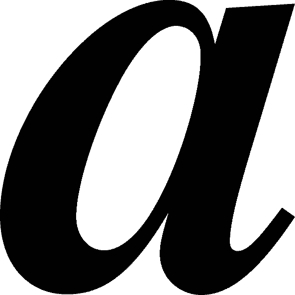
When we write by hand, we use a lower case a, that is, an 'a' with a tail. However, nearly all fonts on a computer use an a just like that. Why is that? Type attempts to be formal, but consider what is formal: efficiency or elegance?

Could type use a to be more efficient when reading; perhaps aiming to be more sharp? a at first glance may not be totally distinguishable from an o or Q. Therefore, font designers may consider the fact that a stands out much more than a as its own letter. This could be particularly helpful for long typed documents. However, type is not just supposed to be efficient. There is a certain elegance that goes along with type; it is capable of precision and consistency that the human hand can not master. In my opinion, a is much more elegant than a... a flows and is much smoother. While some fonts flow and may use more of a cursive style, they are extremely obscure.

A few fonts will change the form of the letter a based on regular or italicized; look at Times regular a and italicized a. There is only really one font that uses a in the font's normal style, and that is Comic Sans; which has a poor reputation. Comic Sans is a relatively new font, so other font designers did not learn from Comic San's mistake. It is interesting the first font to use a is considered a failure in the world of fonts and design; though, I doubt the form of the letter a is a substantial contributing factor. To read more on Comic Sans, see this article from the BBC: http://www.bbc.co.uk/news/magazine-11582548.
No comments:
Post a Comment