Monday, November 29, 2010

Design is Dangerous

I thought I would continue the theme of Adolf Hitler. In my previous blog, I talked about Hitler's initial design of the Volkswagen Beetle and his idealistic beliefs that everyone should own a car for themselves. It is a rare light-side of Hitler, but let us focus on the dark-side that we all know so well. We all know of the hideous and horrific actions taken by Hilter and the Nazi party.

http://www.holocaustresearchproject.org/holoprelude/nazprop.html

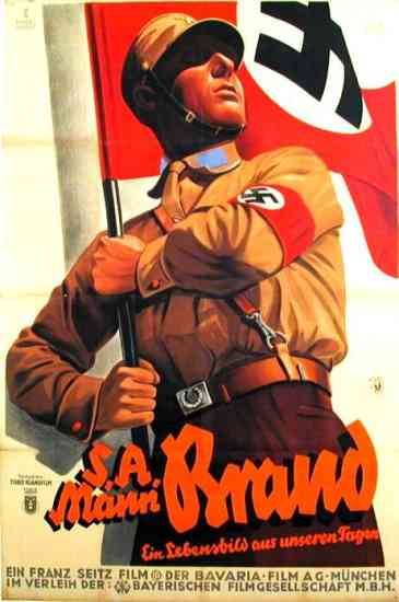
The design of Nazi propaganda is easily recognizable. Like much of advertising and propaganda, the Nazi party believed their views were for the best and would benefit society. However, the persuasive power of this propaganda helped drive a violent movement of genocide. Of course, genocide itself was not actually advertised, the propaganda slyly promoted other corresponding ideas within the Nazi party.

http://thinkingouttabox.wordpress.com/2009/10/11/evolution-of-car-logos/
These images, while not a single design, they represent examples of a specific series of designs. The images represent the idealistic aspects of the Nazi Party while omitting the horrific aspects of it. Advertising is often "sneaky" in this way. They gain support and approval for both aspects of a cause; the glorified good aspects and the omitted bad aspects. It is unfortunate when these plans are successful.
http://www.uncp.edu/home/rwb/hst430_p1.html

Design in Society

What is a design that aims to improve society? I decided to think outside the box a little and talk about the Volkswagen Beetle and its origin. To many people's surprise, the Volkswagen Beetles was initially designed by Adolf Hitler. At first, this thought kind of scared me; I mean... it's Hitler. But giving the idea a little more thought, it makes sense. Hitler strived for a utopian society; while his views meant the genocide of those who would corrupt his perfect world, his main goal was to create an unblemished society in Germany.

http://www.hitler.org/artifacts/volkswagen/
Hitler wanted a simple car that everyone could own; it was "the car of the people." Again, as Hitler believed in a communist society, he strongly felt that every person should own a car; it was a certain privilege or right. Given the time period, automobiles were common, but not to the extent where everyone had one. Hitler believed all his citizens could benefit from having a car; from practical use to vacation and leisurely use.

http://strangevehicles.greyfalcon.us/HitlerKDF.htm
The idea that everyone should own a car is very different from the idea that anyone can own a car. Hitler strongly believed his ideals would make a better place to live; rather, a more overall privileged society.

Color Transforms Design

http://www.ecovelo.info/2010/05/10/the-rolling-stop-and-a-confession/

How does color transform a specific design? Imagine if a well known design were to change its color suddenly, what would be the result? Let's take a stop sign; it does say "STOP" and it maintains its octagonal shape. However, imagine the sign were suddenly changed, perhaps to green or yellow.

Red stands out among all other factors found in the environment. It is easily distinguishable against foliage, because plants are typically green (red's complimentary color). The red also stands out against the blue of the sky, or any neutrals found in nature or urban settings; such as browns, grays, etc. It is pretty easy to see why red was chosen for the stop sign.

http://www.worth1000.com/entries/188559/stop-sig
 What if the sign was green? Well, this probably wouldn't work so well. The green would blend in with any foliage in the area. Additionally, as green and blue are analogous colors, green would not stand out. Also, as green is typically understood as a command "to go," it could get confusing. Of course, the green light could always be changed to another color to indicate drivers should accelerate, but then it creates even more complications.

http://www.myparkingsign.com/MPS/article_Yellow-Stop-Sign.aspx

What about yellow? Now yellow would stand out against most other relative colors in the environment (both urban and natural). However, what about all the other traffic signs? Most of them are yellow too. Now, to avoid confusion, if a stop sign was changed to yellow, we would have to find a new color for all the other signs.

Here, we can see that the appealing aspect of red is that it stands out from other colors. It is dependent on the world around it. As Josef Albers says in his book, Interaction of Color, we never experience colors alone; how we perceive colors is relative to other colors. Green cannot be used for stop signs and green lights that indicate acceleration. Yellow cannot mean stop, slippery roads, lane ends/merge over, and all the other signs; it's just too much for one color.

Monday, November 15, 2010

Ergonomic Design: UCD Student Housing Desk

Ergonomics refers to user safety and ease of use for the user; well designed with the consumers’ wellbeing in mind. Ergonomic design has 5 main points to consider:

1. Safety

2. Comfort

3. Ease of Use
4. Performance

5. Aesthetics

I’d like to talk about ergonomic design in regards to my desk, which was provided for me through UC Davis student housing. I chose to do my desk because I had been experiencing pain in my right shoulder after prolonged use of my desk. As ergonomic design works to prevent stress injuries such as this, I figured analyzing my desk in this manner would provide a new perspective.


Safety of the product refers to whether or not the product inflicts harm to the user or malfunction in a way that will cause harm. The desk is safe in the sense that there are no splinters or direct harm. However, there are certain aspects that seem questionable. For example, the shelf above is not attached to the base and it is possible for it to fall. Basically, there is potential for harm, more so than the average desk.

Comfort of the product has a couple elements: use of the product must not be dreaded. The product is poorly designed if consumers suffer general pain from using it. My desk is not comfortable in the slightest. The panel that pulls out is at an awkward length that can cause pain due to repeated movements (stress injuries). While this could be fixed through chair height, the said chair would have to be capable of a relatively high position, as the desk is abnormally high. Additionally, the desk is very rigid and it is obvious no thought was put into the idea of comfort.


For this section, I will combine both ease of use and performance. Ease of use obviously means how effortless the product is to use and performance considers the product’s proficiency and how well it works. A desk is fairly straightforward, however, this desk has some issues when it comes to functionality. The drawer that pulls out ends up blocking access to the drawers below, especially the top drawer. Lastly for this section, the desk itself does not have much desk space, leaving little room for all school supplies and office-like supplies.

The aesthetic qualities, or visual appeal, are fairly bland. Nothing particularly stands out. The wooden tone is on the lighter side, but still not too pale. The physical properties are boring; no carvings, curves or any such elements are present. While linear lines are not bad, the manner in which they are utilized on my desk are boring. Although, the bland aesthetics can be good because, by nature, the desk is very neutral and therefore will not clash with any area of décor UC Davis students may have in their room.

In conclusion, the desk is not poorly design in a purely aesthetic quality; in that sense, it is designed to fit within an array of designs. However, when it comes for safety, comfort, and functionality, the desk illustrates a failed design. It is not enjoyable to use, in my case it causes stress injuries, and the top shelf is not secure and could easily be knocked off. My conclusion is the desk was relatively cheap, made to look functional without much thought actually going into the design.

A versus A


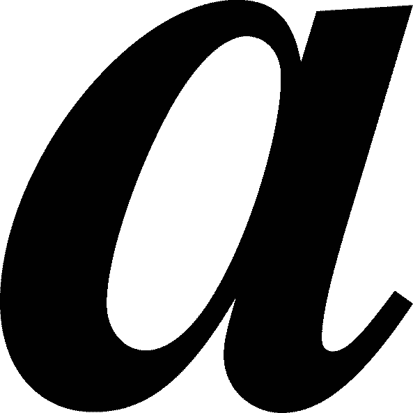
When we write by hand, we use a lower case a, that is, an 'a' with a tail. However, nearly all fonts on a computer use an a just like that.  Why is that? Type attempts to be formal, but consider what is formal: efficiency or elegance?


Could type use a to be more efficient when reading; perhaps aiming to be more sharp? a at first glance may not be totally distinguishable from an o or Q. Therefore, font designers may consider the fact that a stands out much more than a as its own letter. This could be particularly helpful for long typed documents. However, type is not just supposed to be efficient. There is a certain elegance that goes along with type; it is capable of precision and consistency that the human hand can not master. In my opinion, a is much more elegant than a... a flows and is much smoother. While some fonts flow and may use more of a cursive style, they are extremely obscure.


A few fonts will change the form of the letter a based on regular or italicized; look at Times regular a and italicized a. There is only really one font that uses a in the font's normal style, and that is Comic Sans; which has a poor reputation. Comic Sans is a relatively new font, so other font designers did not learn from Comic San's mistake. It is interesting the first font to use a is considered a failure in the world of fonts and design; though, I doubt the form of the letter a is a substantial contributing factor. To read more on Comic Sans, see this article from the BBC: http://www.bbc.co.uk/news/magazine-11582548.


Monday, November 8, 2010

Colors and Color Associations

Different colors invoke different reactions on the human mind. Each color has a different reaction associated with it. These reactions are not blatantly obvious to us, they are subtle. Some common examples are yellow for happiness and blue for sadness. Most of the research regarding color associations is rather... iffy. But I believe there is some truth in these studies. If this wasn't true, then why is blue overwhelmingly the most common favorite color? 

Blue Nude I, Henri Matisse
Stereotypically, blue suggests sadness. However, I think there is more to the color blue than that generic stereotype; there has to be something positive about the color. Some sources say that blue has a calming affect. Others suggest that blue is associated with constant and familiar elements; such as the ocean or the sky. Most of the general population considers blue to be their favorite color, therefore, there has to be more to blue than sadness. There are other indicators that color association is relevant. Consider the combination of red and yellow.
 
It isn't a coincidence that McDonald's, In N' Out Burger, Wendy's, Carl's Junior, Denny's, Sonic, and Pizza Hut have all coined red and yellow as their signature colors. And no, it is not to match the colors of the ketchup and mustard. That color combination has been suggested to stimulate hunger and thoughts of food. Here, all these companies designed their image, not based on the suggested color schemes within the color wheel; they designed based on the human psyche.
 
While many people are skeptical, there is evidence right in front of them that colors do have a psychological stimulating effect on people. I am not saying the effect is significant, but there is something. For those people who still refuse to believe; just consider how much money all those franchises spent on their identity and campaigns. Those companies would not have spent so much money on something that does not matter.

Saturday, November 6, 2010

Words and Images in Cartoons and Comics

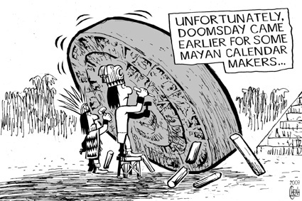
In class with Dr. Housefield, we have spent a lot of time discussing comics. However, I'd like to branch out a little and talk about cartoons and how text is implemented within them. After reading Scott McCloud, we should all understand the difference between comics and cartoons; but I'll just explain the main point. Comics are juxtaposed sequential images, whereas cartoons have singular panels. So how does the use of words differ between the two? Well think about it, they have different functions. Comics tell a narrative, a story; cartoons are images, often over simplified, that are intended to be a humorous comment or satire (according to the dictionary definition). Thus, in comics, text typically helps move the narrative along. In cartoons, text is a quick jab, explanation, or comment.


The above image is a cartoon; it is a single image that makes a humorous comment or stab at an idea. Here, we see members of the ancient Mayans crafting the famous Mayan calender that ends in 2012. While many believe that since this calendar ends in 2012, it marks the end of the world. Obviously, the artist of this cartoon does not believe this, and came up with his or her own "explanation." The text explains what the image means, because without it, we the viewer wouldn't know what the subject matter is really revealing. 


Now this image above shows a comic. The text is used to move the story along. There isn't a short, quick explanation of everything, there is no underlining commentary on the subject matter. However, what we do see is words progressing and moving the story forward.

Thursday, November 4, 2010

Text and Images in Information Design

What is the importance in joining text with images? Let us consider the use of text with images in design; text conveys information, an idea, or a narrative. We can see these uses in graphs, advertisements, comics and more. Yes, I said graphs. Graphs are part of the informational aspect of design, which is typically outside our narrow definition of "design." Information design, which displays quantitative information, reaches all realms of study and aspects of life. Graphs, diagrams, maps, books; these are examples of information design. The principles and elements of art and design apply here. In the book, Design Basics, Lauer and Pentak talk about various elements of design, such as line, color, scale and proportion. All of those elements can be applied to graphs (as well as other forms of information design).We typically think of them as purely forms of information; they explain things to us. However, their explanations would be useless if they was not designed in an efficient way that we could understand. If it wasn't for text and image working together in information design, our society would suffer greatly from the lack of accessible data.

http://upload.wikimedia.org/wikipedia/commons/8/87/Tokyo_subway_map.PNG
http://kara.allthingsd.com/20080514/memo-to-don-graham-thar-he-blows/

Think about it... Without proper maps, how would anyone know which subway train to take? Without labels on diagrams, how could anyone understand their science text book? Without labels and numbers on graphs, those charts in math class would be even more complicated. Education and travel would be exclusive privileges given to the elite.


Examine the diagram above. Try to name every part of the animal cell depicted. It isn't so easy. Even if you were simply trying to learn, it would be difficult if your text book explained things like "... and the tail-like extremity is called the 'flagellum,' and the yellow structure to the right is called the..." This would require a lot of jumping back and forth, proving an ineffective and inefficient means to communicate information. Look below at the diagram; with labels. The drastic change in understanding makes a huge different in the usefulness of the diagram. 

http://www.kvhigh.com/Documents/Notes/reid/reid.html

Now let's consider a different kind of information design; with minimal text and minimal images compared with diagrams. When we think of graphs, we probably think of our last math or economics class. But text, image, and design are all present here. If you look below, the graph has lines, it is color coded, and the scale is even across all visual elements. But without words or numerical values, it is impossible to understand the graph.


Perhaps one of the biggest accomplishments in information design was done by Massimo Vignelli and his work with mapping the New York subway. Without Vignelli's work, one can only imagine the chaos that would plague the New York public transportation. His use of lines, points, shapes/forms, color coding and so on clearly indicates a use of design as explained in Design Basics. And while some information could be concluded from those pictorial elements alone, that information would be insufficient; the text is necessary to determine the meanings.

http://www.apartmenttherapy.com/ny/artwork/massimo-vignelli-updates-his-new-york-city-subway-diagram-048963
Monday, November 1, 2010

Poorly Designed

What constitutes as a bad design? In my opinion, it is when the design does not effectively or efficiently achieves its goal. My last couple posts talked about industrial design and functionality within that realm; however, what about poor graphic designs? Graphic design, or visual communication, strives to convey a message or emotion. If the viewer cannot comprehend the message right away, the image is poorly designed. Consider the 2012 London Olympics logo.

I first saw this logo months ago, and I only saw shapes. It wasn't until I read an article on the BBC website that actually specified that the logo depicts "2012." Finally, after months, I saw the 2, the 0, the 1, and the second 2. Then, talking with others, I have found I am not the only one who didn't see the message, the content, that was intended. Some people can't help but see shapes, or an actual picture/scene when looking at the logo (the said scene depicts a long time cartoon character, and that is all I will say). Personally, I did not see a specific scene, but I found myself trying to figure out if the logo was trying (and failing) to be an actual scene or if it was merely shapes. In the end, I was wrong on both accounts. What could have been done to avoid this graphical disaster? Color varients between the digits? Letter spacing? Less abstract and more traditional typography? It is difficult to speak for the whole, but from my perspective, all the above could improve the design. While that is purely subjective, others may find that the logo as a whole should be scrapped and a new logo should be designed.

Objectified: Form and Content


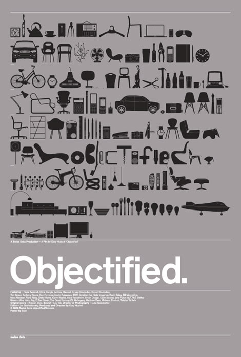
What is content and form? And what do they have to do with one another. Content is the idea conveyed through a piece while form is the shape and structure of the piece (according to Lauer and Pentak from Design Basics). In the documentary film, Objectified, director Gary Hustwit shows his audience the world of Industrial Design. In the everyday world, the idea that everything we use and see that is man made was designed. Typically, for me anyways, we will see an object and not give a second thought as to how it came to be; of course it’s here, of course it's like that. Tooth picks, bowls, spoons, etc. are overlooked and taken for granted, and industrial designers remain forgotten.

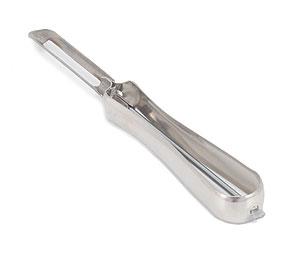
Let's consider how content can apply to industrial design as illustrated in Objectified. Content can be the functionality and purpose of an item, but in a more specific way than usual. Consider a peeler (such as for potatoes), it is one thing to have simple peeler that is meant to peel various foods. However, the purpose may extend further, such as when ergonomics are applied. Ergonomics refers to something that is well-designed, user-friendly, comfortable, and safe. The example in Objectified showed ergonomics applied to a peeler and spread to other tools. Here, the peeler was altered to cater to the needs of arthritic users. This altered the form of the peeler by introducing an new aspect to the content. The form was changed to be more comfortable for users of the peeler because the content changed by adding concern for the user's comfort to the intention rather than just having a basic peeler.

http://www.lefsetime.com/store/template/product_detail.php?IID=138

http://www.organize-it-online.com/itm_swivel-peeler.html